If you’ve been wondering what pages a campground website should include to get more bookings, you’re already asking the right question. Many campers make their decision online well before they ever pick up the phone. They open a few browser tabs, scan each campground site quickly, and close the ones that don’t answer their questions fast enough. A clear, complete website meaningfully increases your chances of winning the booking, especially when it shows rates and availability upfront.
Think about the questions running through a camper’s head: “Does this place look right for me? Can I bring my dog? Can I fit a 40-foot fifth wheel? How much does it cost, and can I actually book it right now?” Each page on your campground website either answers one of those questions or it doesn’t. If it doesn’t, the visitor is gone. Some campground web teams build their entire site architecture around this guest decision journey because they’ve been on it themselves as actual campers, and that firsthand experience shows. That’s the approach behind RV Park and Campground Websites (Built By RVers).
Here are the 10 essential campground website pages that do the real work: from first impression to final confirmation, grouped by where they fit in the guest’s path to booking.
What pages should a campground website include to get more bookings?
First impressions: the two pages that make campers stay or bounce
1. Homepage: your 10-second pitch to a scrolling camper
The homepage isn’t a brochure. Its job is to communicate your park’s identity, show your best visuals, and route visitors toward the right next action, which is almost always your rates or booking page. A strong headline with your location, one compelling hero photo, and a visible “Check Availability” button above the fold are the non-negotiables. Everything else supports those three elements.
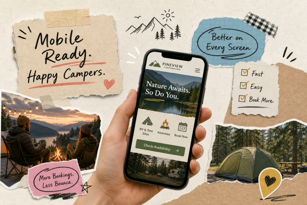
A common homepage mistake is a wall of text with no clear path forward. Campers don’t read their way into a booking. They scan, they feel something, and they click. Page speed and mobile layout matter most here because this is often the first page loaded on a phone, and more than half of all web traffic now arrives from mobile devices, making mobile-first design an RV park website must-have, not an afterthought. For a practical walk-through of effective homepage and mobile-first layouts, see How to Design an RV Park Website That Gets More Bookings.
2. About page: why your story builds trust before booking
Campers booking an independent park want to know who’s running the place and what kind of experience to expect. The About page handles the “is this run by people who actually care?” question, and most campground owners underestimate how much weight it carries. Include owner background, park history, what makes your location special, and real photos of real people. Stock images of generic forests don’t cut it here.
Owners who’ve camped themselves tend to write About pages that resonate, they know what guests wonder about before arrival, and that shows in the details. Practical touches like seasonal advice, campfire etiquette, or notes on nearby dog-friendly trails are the kind of specifics that build trust before a camper reads a single rate. Authenticity here carries more weight than polished marketing copy.
The “is this place right for me?” pages
3. Amenities and site types: where booking decisions actually happen
This is the page where most booking decisions are made or lost. Campers need to know hookup types, site sizes, pad surface, pull-through availability, pet policy, Wi-Fi, bathrooms, pool, and laundry. Hookups, pet-friendliness, and big-rig accessibility are among the most commonly searched-for attributes campers use to evaluate a park, so these need to be front and center, not buried in a paragraph.
Structure this page by site category: tent sites, RV sites, and cabins each get their own section with clear specs. Campers who can self-select the right site type arrive at the “Book Now” button with far more confidence. A well-organized amenities page is a conversion tool, not just an information dump.
4. Photo gallery: the page that sells the feeling, not just the facts
A gallery isn’t decoration. Campers visualize their entire stay from photos before they ever read your rates, which makes this page one of your most powerful trust-builders. Organize it by category: sites, bathrooms, common areas, seasonal shots, and activities. Visitors shouldn’t have to scroll through 60 random images to find what’s relevant to them.
Aim for 20 to 25 high-quality, current photos with short captions for context. Fifteen great photos outperform 40 mediocre ones every time. Your hero shot does the most work, it determines whether a visitor lingers or keeps scrolling. Dark images, outdated infrastructure shots, and stock-photo nature scenes that don’t show your actual park are the fastest ways to lose a booking on this page.
The pages that handle the money conversation
5. Rates and availability: transparency wins the booking
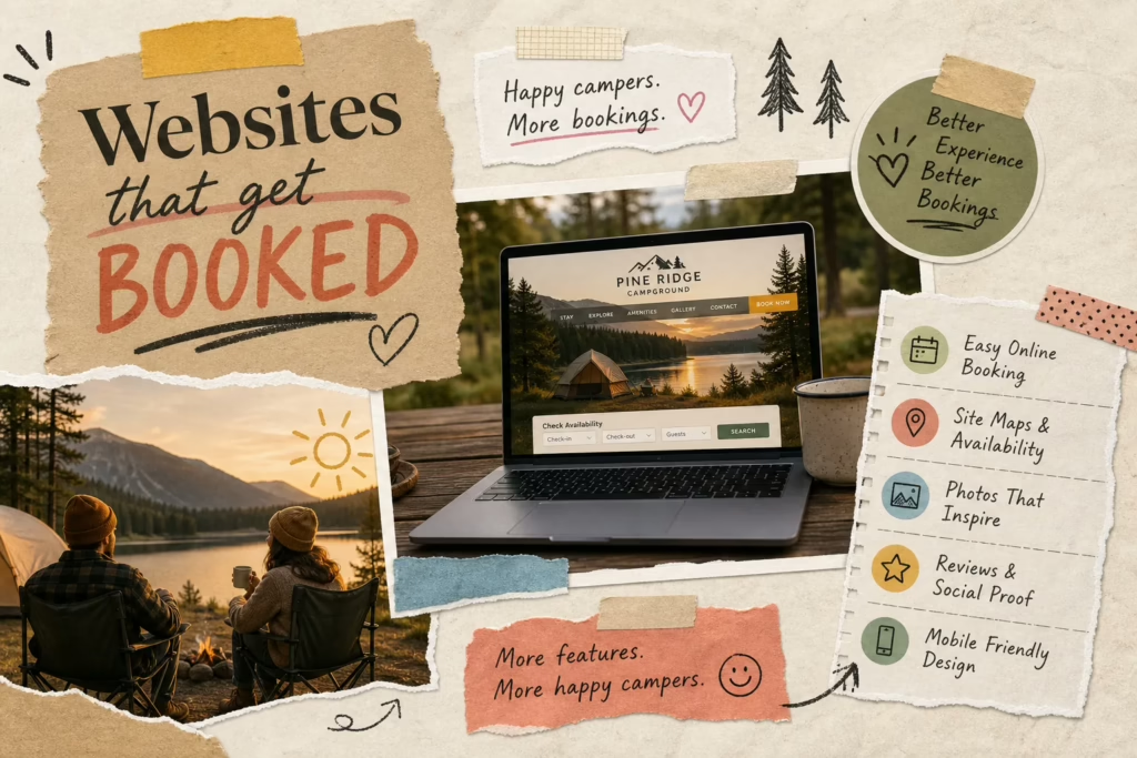
Show all rates up front, broken down by site type: nightly, weekly, and seasonal. Hiding rates forces campers to call, and many simply won’t bother, they’ll click to the next park instead. A live availability calendar removes the biggest pre-booking objection (“Is my date even open?”) before the camper has to ask. Place “Book Now” or “Check Availability” buttons next to every site type, not just at the top of the page.
Where it’s honest, add urgency. Peak season dates filling up and limited weekend availability are real factors that move people from browsing to booking. Campground sites with embedded booking engines convert visitors to checkout at rates well above the hospitality industry average, which sits around 1 to 3 percent for properties without a direct booking flow. If you’re evaluating reservation platforms, review options specifically built for campgrounds like reservation software for campgrounds to find one that supports live calendars and embedded checkout.
6. Booking page: where friction becomes the enemy
This is the highest-stakes page on your site. The camper is ready to commit, and anything confusing or slow loses them completely. Embed your reservation engine directly on your site rather than redirecting visitors to a third-party platform in a new tab. That redirect breaks the experience and hurts conversion rates.
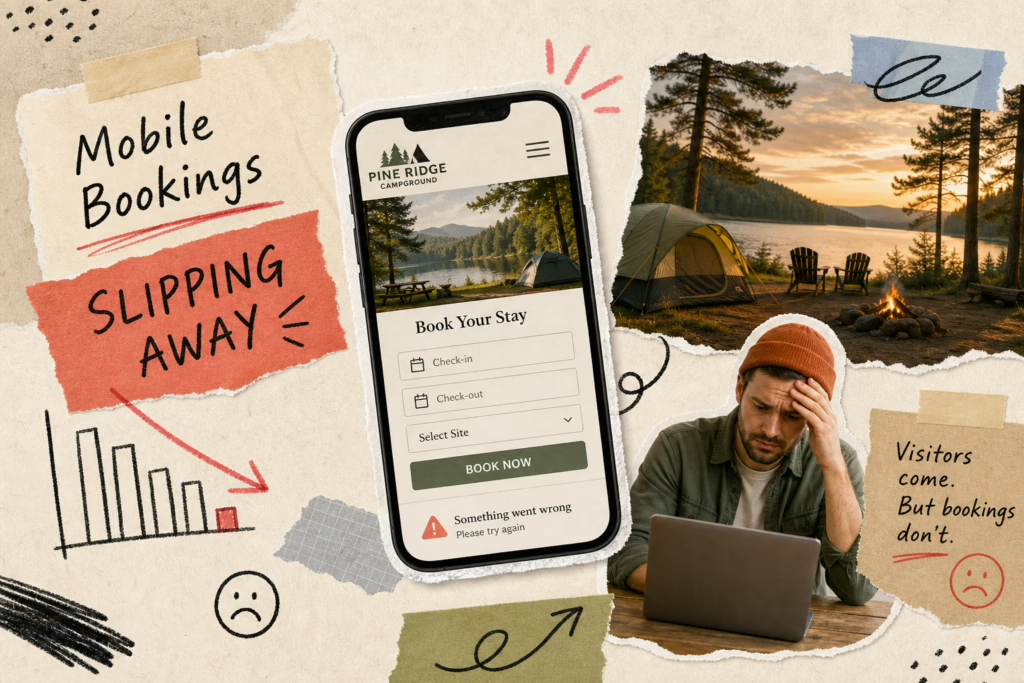
Mobile UX is critical here. The booking flow should work cleanly on a phone with minimal typing required. A system built with booking-platform flexibility means it works with whatever reservation software the park already uses, or handles the flow independently if needed. Friction on this page is expensive, remove every unnecessary step between “I want to book” and “booking confirmed.” Simple UX tweaks, like a prominent, single-click “Book Now” control, can measurably improve conversions; read more about improving reservation CTAs with a custom Book Now button.
Pages that kill hesitation right before checkout
7. FAQ page: answer the questions guests are too shy to ask
Most campers arrive at a first visit with the same set of questions: check-in time, cancellation policy, generator hours, campfire rules, pet size limits, whether there’s cell service. A well-structured FAQ page handles all of these in one place, reducing calls to your front desk while building guest confidence before they click “Book.” Structure it with clear categories like Reservations, Policies, Amenities, and Arrival rather than one long scroll.
There’s an SEO bonus here too. These are the exact phrases people type into Google, so a thorough FAQ page helps your park surface in search results for the specific questions your future guests are already asking.
8. Reviews and testimonials: let satisfied guests close the sale
Third-party social proof from real campers is more persuasive than anything you can say about your own park. Pull in Google and Facebook reviews, or embed a testimonials section with names and specific details, not generic “great place!” quotes. Photo reviews and reviews that mention specific amenities are the most effective because they answer the “will this match my expectations?” question directly.
Link this page from your booking flow so hesitant visitors can read it without abandoning their reservation. Social proof is particularly powerful for first-time visitors who are almost ready to commit but want one last confirmation that other families had a good experience.
Pages that help serious campers feel prepared
9. Local attractions: sell the destination, not just the campsite
Campers aren’t buying a site. They’re buying an experience in a place. A local attractions page reinforces the value of your location with nearby hiking, fishing, towns, events, and day-trip options. Keep it curated: 8 to 12 genuinely useful spots beats a bloated list of everything within 50 miles. Quality over quantity keeps the page useful and the visitor engaged.
This page also carries real SEO weight. It signals to Google that your park is relevant to searches like “camping near [attraction],” which expands the number of searches your site can rank for beyond just your park name and location.
10. Campground map and directions: remove the last bit of uncertainty
A visual site map answers the question every first-time visitor has: “What’s the layout like, and where is my site relative to the bathrooms and entrance?” An interactive or clearly labeled static map showing site locations, amenities, roads, and key landmarks builds confidence and reduces arrival confusion. For RV travelers in particular, knowing road widths, low-clearance warnings, and highway approach notes isn’t optional, it’s the difference between a smooth arrival and a stressful one.
Pair your map with GPS coordinates and approach notes for large rigs. This page also reduces “I couldn’t find it” calls on check-in day, which is a win for your staff and your guests alike.
These 10 pages only work when they work together
Most campground owners either have a bare-bones site with a homepage, contact form, and phone number, or a generic site built by a local web designer with no campground context. The result is pages that technically exist but don’t do their job in the guest’s decision journey. A rates page without a live calendar, a gallery with five blurry photos, an About page with no personality, each one is a leak in the conversion funnel.
This is exactly the problem that RV Park and Campground Websites (Built By RVers) was built to solve. The team designs all of these pages from scratch, written by people who’ve actually camped and understand what guests look for before they book. Their flat monthly model means park owners get a full professional site with SEO, mobile responsiveness, and booking integration built in from day one, not bolted on afterward. The team handles ongoing updates so your rates page stays current and your gallery doesn’t go stale six months after launch. If you’d like a broader strategy for growing occupancy, read How to Get More Campers to Your Campground This Year for tactics that pair well with a professional site.
If any of these pages are missing or underdeveloped, that’s where your bookings are leaking out, learn more about What Pages and Features Should a Professional Campground Website Include? to audit your site against this checklist.
Your campground website is your best salesperson
Every page on a well-built campground website exists to answer a specific question a camper has on their way to booking. Curiosity gets answered on the homepage and About page; research happens on amenities and gallery pages. The money conversation closes on rates and booking pages. Hesitation gets handled by FAQs and reviews. Preparation wraps up with attractions and directions.
These are the pages a campground website should include to get more bookings, and to turn visitors into paying guests without a sales team, a big ad budget, or a phone call. Audit your current site against this list. If any of these pages are missing or underdeveloped, that’s where your bookings are leaking out.
Ready to build a site that covers all of this? Contact our team to get started.