Making sure your RV park’s website works smoothly on smartphones is essential today. Most potential guests plan and book trips right from their phones and often on route, so if your site isn’t mobile-friendly, you risk losing bookings before visitors even explore what makes your park special.
Many RV park owners (and guests) face frustration with sites that are hard to navigate on phones, and the technical side can feel overwhelming when you’re busy managing your park.
Did you know: 81% of campers search online before booking, highlighting the importance of a well-designed website for RV parks.
At campgroundwebsites.com, we’ve been building websites since 2011 and living the full-time RV lifestyle since 2018. We’ve seen our share of campground websites. Making your RV park website mobile-friendly is readily achievable (and selfishly, serves the RVing community better), and we’re here to guide you through it if you’re a DIYer or provide a simple, affordable full refresh when you’re ready.
Why Your RV Park Website Has to Work on Phones (It’s Not Optional Anymore)
Most travelers now use mobile devices; 70% of searches for RV sites happen on phones (which means based on the statistic above, only 11% search on desktop). If your site isn’t mobile-friendly, visitors will leave due to tiny text, hard-to-tap buttons, or horizontal scrolling. Over half abandon sites that load slower than three seconds, costing you bookings and revenue.
Mobile responsiveness means your website automatically adapts to any screen size, offering a smooth experience without pinching or zooming. Features like single-column layouts and hamburger menus enhance usability. The viewport meta tag ensures proper scaling on mobile screens.
To improve your RV park website for phones, use a responsive theme or template from platforms like WordPress or Wix. Compress images for faster loading, simplify navigation with easy menus, and make buttons at least 44×44 pixels with enough spacing. Test on real devices to ensure smooth functionality and quick load times.
How to Tell If Your Campground Website Is Actually Mobile-Friendly
To check if your RV park website works well on mobile devices, pull it up on your phone (and ask a few people in the office to try on theirs also). If you have to zoom or scroll sideways to see any images or read any text, your website is not mobile responsive.
You can also test manually by browsing your site on a smartphone.
Slow loading times or large images that distort the layout are also red flags. Important info like your address, phone number, and booking calendar should be easy to find without excessive scrolling or clicks.
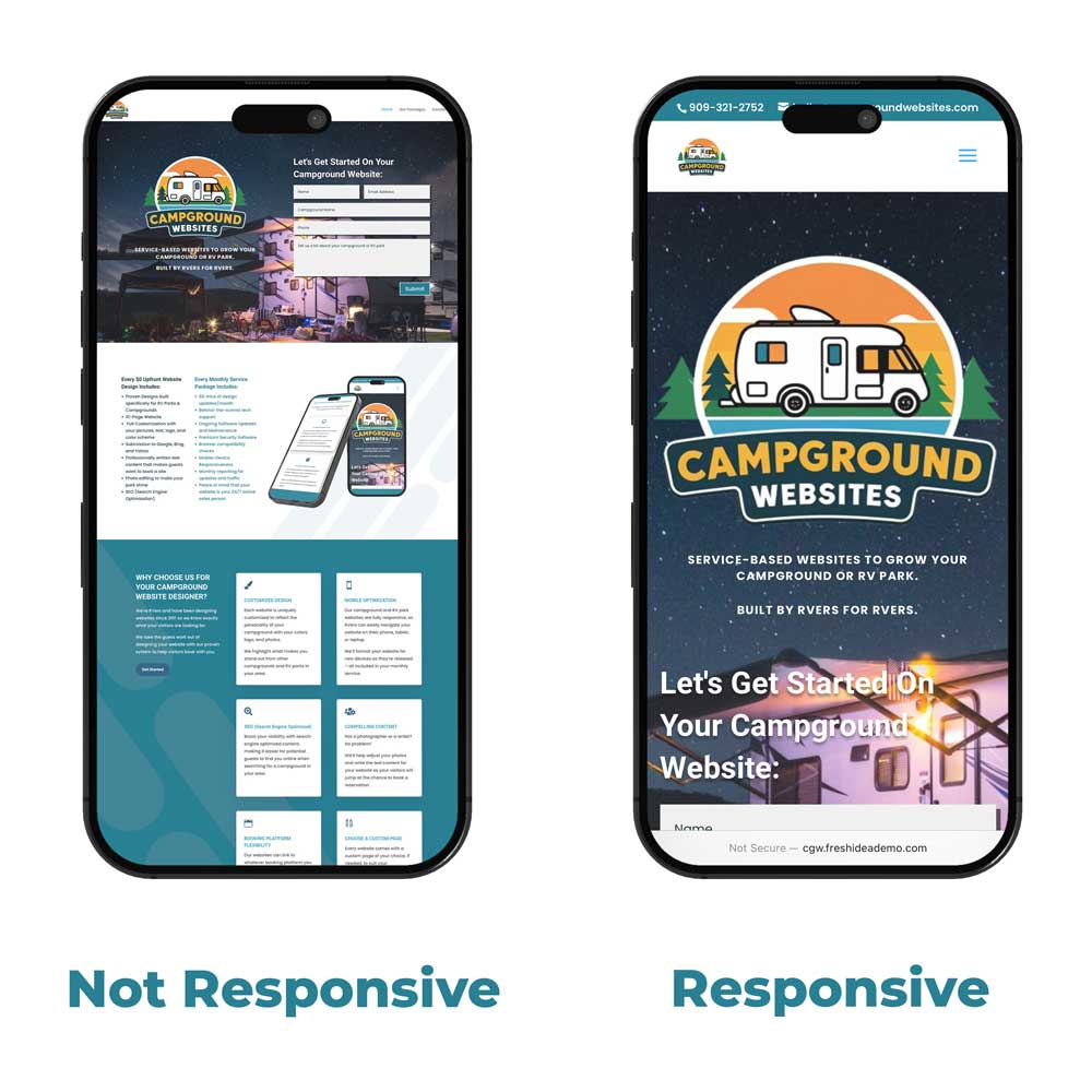
Your campground website needs to be mobile responsive and adjust to the size of the user’s device
What Makes a Website “Mobile Responsive” in the First Place?
When we talk about a “mobile-responsive” website, we mean a design that adapts its layout, content, and functionality seamlessly across all devices, from desktops to smartphones. Your website detects which device is being used (a small phone, a medium-sized tablet, or a large desktop) and “responds” with a layout that matches the device size and the orientation.
Elements rearrange, resize, and reposition automatically for the best viewing and interaction experience for the user.
Non-responsive sites often require pinching and zooming or have layouts that break on small screens, making navigation difficult. A responsive campground website automatically adjusts by stacking multi-column layouts into a single column on phones and replacing wide navigation menus with a compact “hamburger” icon.
The ‘viewport’ meta tag tells browsers to scale the page to the device’s screen size instead of a fixed desktop width, which is essential for responsiveness. For RV park owners, this means your booking calendar, photos, and contact info are easy to access and use on any device, helping convert visitors into booked guests.
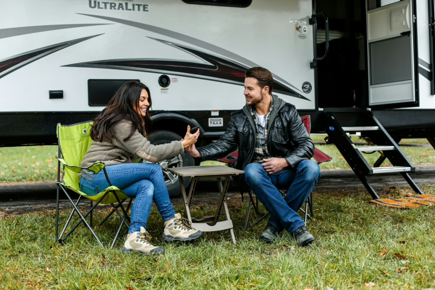
70% of campers find their next campground on their phone
DIY Steps to Make Your RV Park Website Work on Phones
If your campground website designer won’t return your calls, and you’re looking to tackle some improvements yourself, there are several manageable steps you can take to improve your RV park website’s mobile responsiveness.
Starting with a solid foundation is key, and for most RV park websites, this means adopting a mobile-first mindset and choosing the right tools. Your goal is to make sure the most critical information and actions – like checking availability, booking a spot, and finding your contact details – are front and center and incredibly easy to use on a small screen.
(*Side Note: We’re a little biased, but we think you should be focused on your guests, not trying to learn how to build a mobile-responsive website, so we offer a $0 up front service which would give you a completely fresh campground website. Click here to check out our options.)
Start with a Responsive Theme or Template
If your current website platform allows you to choose a new design, look for themes or templates explicitly labeled as “responsive.”
Content Management Systems like WordPress, Squarespace, or Wix all offer a wide variety of these. A responsive theme is built with the underlying code that makes it automatically adapt to different screen sizes.
When selecting one, pay attention to how it displays essential RV park features:
- Are amenity lists easily readable?
- Can you click on something in the menu without accidentally clicking the item next to it?
- Can you easily find the button to make a reservation or contact the office?
- Does clicking your phone number open the phone app to make a call?
Optimize Your Images and Media
Large image files are one of the biggest culprits behind slow-loading mobile websites. Sometimes your website is ready to be displayed on a mobile device, but your images are so large, they’re slowing down the website from loading so people close your website and search for another campground instead of waiting.
For an RV park website on phones, you want to showcase your beautiful grounds, but not at the expense of speed. We use image editing tools to compress your photos before uploading them. Aim for file sizes that are as small as possible without a noticeable loss in quality.

A slow website means people will look for someone else’s campground website
Additionally, instead of loading videos on your website, post them on Youtube, then embed the video code on your site. This allows a viewer to still watch the video, but it’s loading from YouTube servers instead of being hosted (and slowing down) your website.
We use a tool to test speed: tools.pingdom.com and your RV park website home page should load in less than 5 seconds.
Simplify Your Navigation
On a small screen, complex navigation menus can be overwhelming. Most responsive designs use a “hamburger” menu (three horizontal lines named because it looks like a bun and a hamburger patty) for mobile. This keeps your primary navigation clean and out of the way until the user needs it.
Think about the most important things a camper is looking for on your site: availability, rates, amenities, location, things to do in your area, and contact info. Prioritize these and make sure they are easily accessible through your mobile menu. Avoid deep, multi-level dropdowns that can be frustrating to navigate with a fingertip.
Make Buttons and Links Easy to Tap
Mobile users interact with websites using their fingers, so buttons and links need to be large enough to tap accurately. We space out clickable elements on all of our client websites to prevent accidental clicks.
Your “Book Now,” “Contact Us,” or “Campsite Map” buttons should be prominent and easy to find. If they’re buried or require precision tapping, your visitors might give up before completing an action.
Test on Real Devices, Not Just Your Desktop
While desktop previews can offer a glimpse, the only way to truly know if your responsive campground website is working is to test it on actual smartphones and tablets.
Ask friends or staff to try browsing your site on their devices (phone and tablets), or use your own phone’s browser.
Try different screen orientations (portrait and landscape) and different browsers (Chrome, Safari, Firefox) if possible.
Be sure to test your campground website on multiple mobile devices
When DIY Isn’t Enough: Get a new Campground Website Without the Big Price Tag
We understand that diving deep into website code, optimizing images, and testing across multiple devices can be a lot to ask of an already busy RV park owner or manager. You’re focused on providing a fantastic guest experience at your park, not wrestling with website best practices.
While the DIY steps above can help improve your current site, many older websites or those built on less flexible platforms might require a complete overhaul to truly be mobile-friendly and responsive. This is where professional help can make a world of difference, but often, the upfront costs associated with web design can be a significant barrier.
With years of web design experience (since 2011) and firsthand RV lifestyle knowledge (since 2018), we offer a full mobile-responsive website service tailored for RV park owners.
Our service requires no upfront cost—just a monthly fee covering hosting, domain registration, ongoing support, local SEO to help campers find you, and up to 30 minutes of monthly design updates. Simply send us your changes—like updating hours or adding photos—and we’ll handle the rest, ensuring your website stays current, secure, and easy to use on any device.
Sum it up: How do I make my RV park website work on phones?
- Many potential guests search for and book RV parks using their smartphones, making mobile responsiveness essential.
- An unoptimized mobile website can lead to lost bookings as users leave for competitor sites.
- You can check your site’s mobile-friendliness using free tools like Google’s Mobile-Friendly Test and by manually testing on your own phone.
- Key issues include tiny text, horizontal scrolling, hard-to-tap buttons, and slow loading times.
- A truly responsive website automatically adjusts its layout for any screen size.
- DIY improvements include using responsive themes, optimizing images, simplifying navigation, and ensuring easy-to-tap links.
- For a complete, hassle-free solution, consider professional services like campgroundwebsites.com, offering a full mobile-responsive website service with $0 upfront costs and affordable monthly fees that include hosting, support, SEO, and design time.
Ready to make your RV park website a powerful booking tool that works flawlessly on phones? Don’t let a clunky or outdated website hold your campground back. Click here to get started.